This tracker will be updated throughout the 2020 primary season. Current version includes initial Super Tuesday results, except Massachusetts and Maine.
The Super Tuesday Democratic primaries reinvigorated Joe Biden’s campaign and has put him in the lead, at least for now. His popular vote margin is widest where Trump won in 2016 and where jobs are more at risk from automation. But Bernie Sanders leads the popular vote in urban counties.
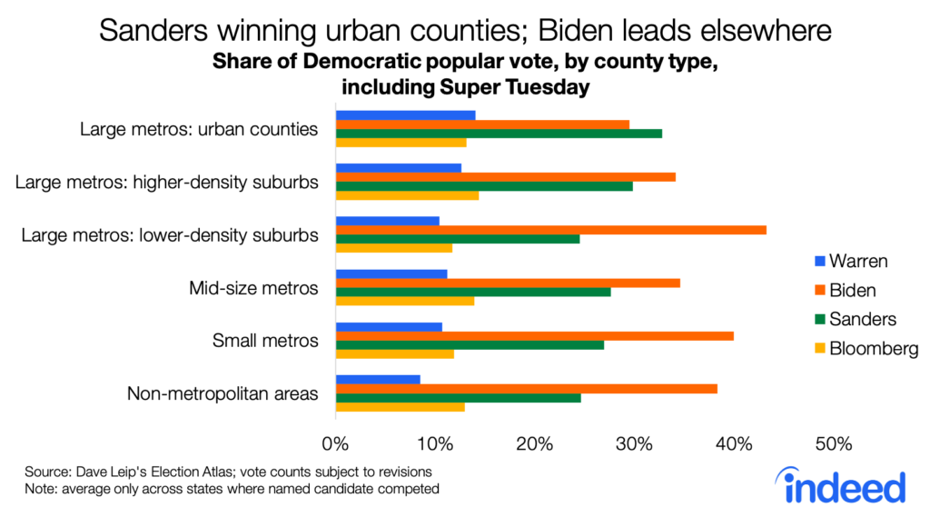
County primary results show that Sanders leads only in the urban counties of large metros. Biden’s lead is widest in lower-density suburbs, small metros, and non-metropolitan areas. Elizabeth Warren performed best in urban counties, while Mike Bloomberg did best in higher-density suburbs and mid-size metros.
Biden’s strength in smaller places means his lead is widest in counties that voted for Donald Trump in 2016 — an election highly skewed by geography. Biden also leads the primary popular vote in counties that voted for Clinton and that were close races in 2016, but by a smaller margin.

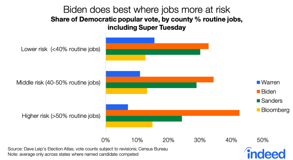
The 2016 vote was very highly correlated with a measure of future local economic prospects: the share of jobs that are at greater risk from automation because they are “routine.” These include blue-collar jobs as well as sales, administrative, and clerical work. In counties with more routine jobs, Biden is far ahead in the primary vote. The race has been closer in counties at lower risk from automation, where the economy has more professional, technical, and service jobs. Warren has performed best in these counties at lower risk from automation.
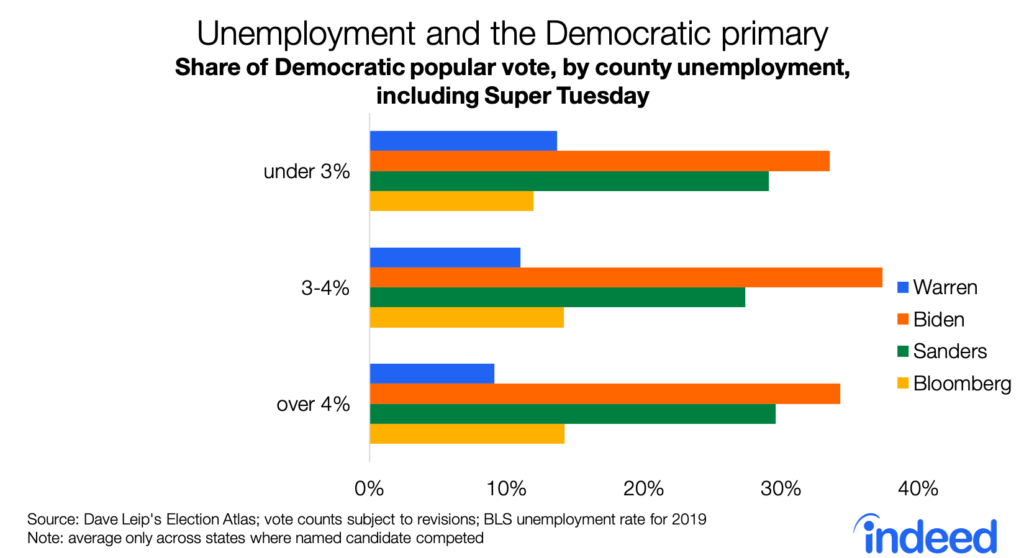
Finally, the primary vote looks similar across counties with different unemployment rates. Biden leads Sanders in both lower and higher unemployment counties. Again, Warren has done best where the economy is in better shape.
Still, the economy is not the main driver of the Democratic primary vote. Unemployment, routine jobs, and other economic measures are themselves correlated with demographics — and the candidates have clear strengths and weaknesses with particular demographic groups. Yet even when accounting for county-level age, education, and race & ethnicity, economic factors remain correlated with the primary results:
- Biden has done better where more jobs are at risk from automation and where unemployment is higher — in addition to doing better in counties with more African-Americans and fewer young adults.
- Sanders has done better in places where there is job growth without wage growth. But his strength in young and Hispanic counties, and weakness in African-American counties, matters more.
- Warren has done better in highly educated counties — and even more so in those where unemployment is lower and fewer jobs are at risk.
Note:
Data are from Dave Leip’s Election Atlas, the U.S. Census Bureau, and the U.S. Bureau of Labor Statistics. All data are for counties.
The analysis of whether economic factors matter is based on a regression analysis of each candidate’s vote share on economic and demographic characteristics of counties, weighted by the county’s total vote. Only states where the candidate competed were included, and the regression used state fixed-effects to account for the different timing and candidate lists across states.