Key Points:
- Watch what happens to layoffs in the months ahead. Layoffs are near a multi-decade low, but a large enough rise in the rate of workers losing their jobs could be a sign that the labor market is not just slowing down but moving backward.
- The US labor market remains hot as demand for workers outstrips worker readiness to take jobs, even if there are signs it is cooling.
- This overshoot of demand is the root cause of the current strong wage growth, though inflation has diluted those gains and wages are no longer accelerating.
- The number of jobs continues to grow briskly as demand remains elevated, even as the recovery slows as employment approaches pre-pandemic levels.
Spotlight: Layoffs remain low, but watch out for a rise
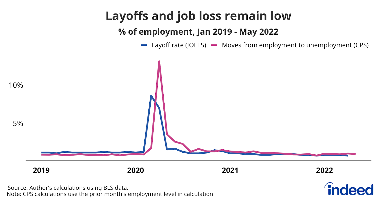
Not only is joblessness low these days, but so is the rate at which workers are losing their jobs. Demand for workers is high, meaning that employers not only want to hire new workers, but hold on to the ones they already have. In fact, the layoff rate as of April 2022 was tied for the lowest level in more than 20 years. After the historic highs hit two years prior amidst the initial shock of COVID-19 pandemic, layoffs and job losses are holding steady at low levels.
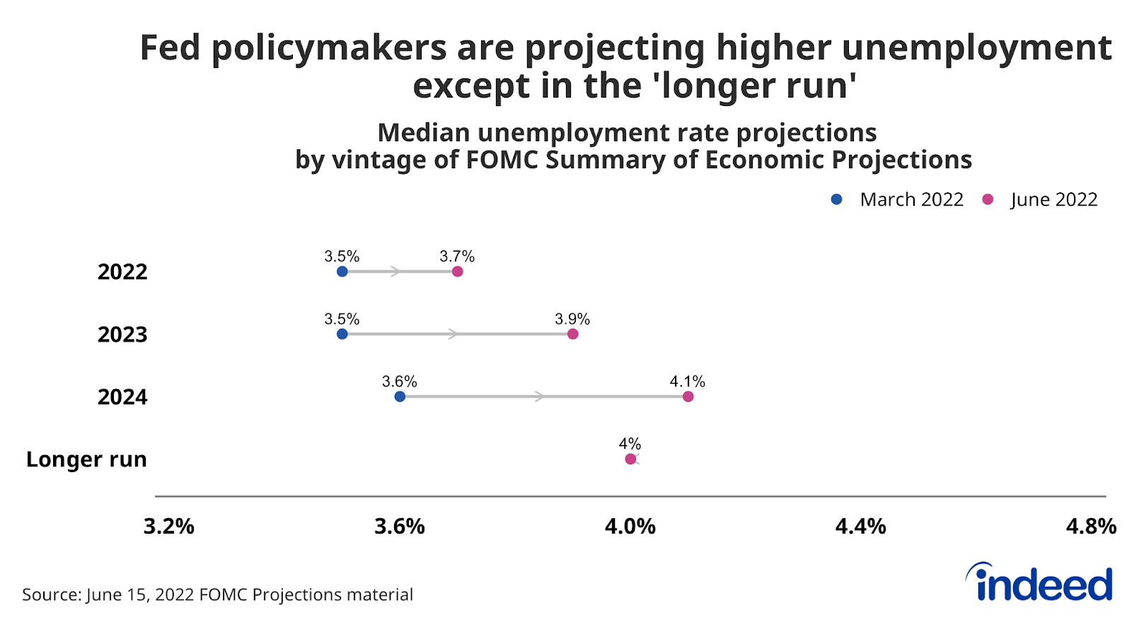
But that could change. Concerns about a recession abound these days as the Federal Reserve signals it’s willing to let unemployment rise in an effort to bring inflation back under control. But Fed policy makers argue they can do this while keeping the economy growing. Specifically when it comes to the labor market, the argument is that demand for workers is so strong that the unemployment rate will rise in a contained fashion. This controlled rise in unemployment would come mostly from a drop in unemployed workers finding jobs, rather than a more sudden rise in layoffs.
But it’s not clear that a significant pullback in demand for workers will show up primarily as a reduction in hiring. So while it’s important to track a wide range of labor market statistics, data on layoffs and job loss should be in greater focus moving forward. In particular, be on the lookout for new data on sectors related to the interest-rate sensitive housing market such as construction and real estate and rental and leasing. Layoffs continue to be very low, but they won’t always be.
Labor Market Overview
The US labor market remains hot. As the US economy has bounced back from the initial COVID-19 shock, demand for labor has grown much more quickly than supply. Employment has rebounded, wages are growing quickly, and joblessness is approaching pre-pandemic levels. But now the labor market is showing some signs of normalizing as demand cools, supply increases and wage growth levels off. This normalization faces roadblocks in the form of aggressively tightening monetary policy, geopolitical instability, and the evolution of the COVID-19 pandemic.
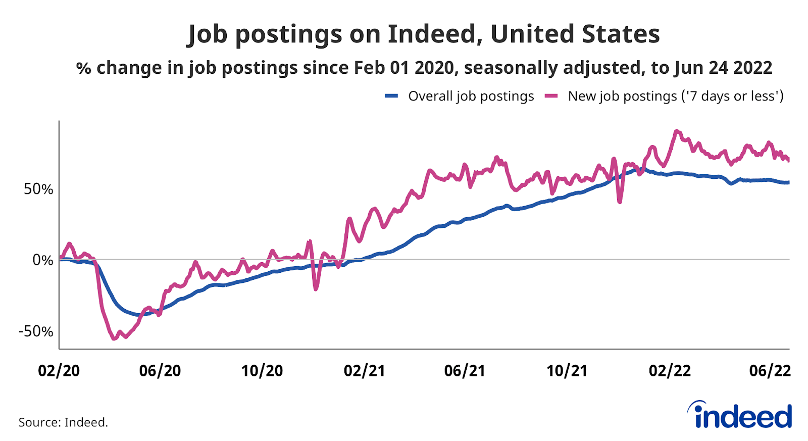
Employer demand for workers remains strong, with Indeed job postings as of June 24, 2022 54.2% above their pre-pandemic baseline. New job postings, defined as those on Indeed for seven days or less, are also well above their pre-pandemic baseline, up 68.3%. While job postings growth has slowed, the leveling out has been moderate.
In the wake of hiring freeze announcements within the tech sector, software development job postings on Indeed look to be cooling. Over the last six weeks, software development job postings have fallen 8.9% but remain 114% above their pre-pandemic. Employer demand for software development workers is moderating, it is still incredibly strong.
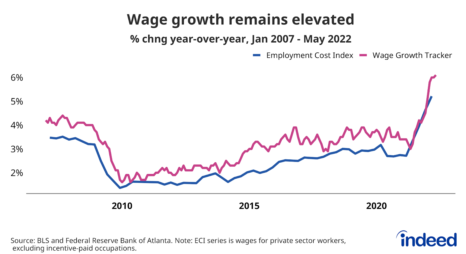
Strong wage growth, but inflation is eating away gains
Strong demand for workers combined with acute hiring difficulties across multiple sectors have driven wages up roughly 6% on an annual basis, a higher growth rate than at any point in over the past 20 years. This is what economists call nominal wage growth — that is, pay gains before taking inflation into account. However, rising prices are eating away those gains and causing many employees to lose ground when it comes to actual purchasing power.
One of the biggest questions for the US economy is the future path of nominal wage growth. Wages are no longer accelerating and may be starting to slow as competition for new hires tempers. Should wage growth dip considerably, inflation would have to drop substantially to keep even more workers from seeing their inflation-adjusted wages decline.
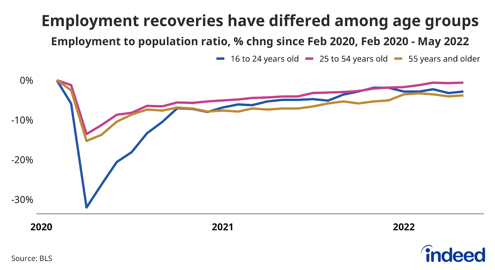
People of prime working age are returning to work
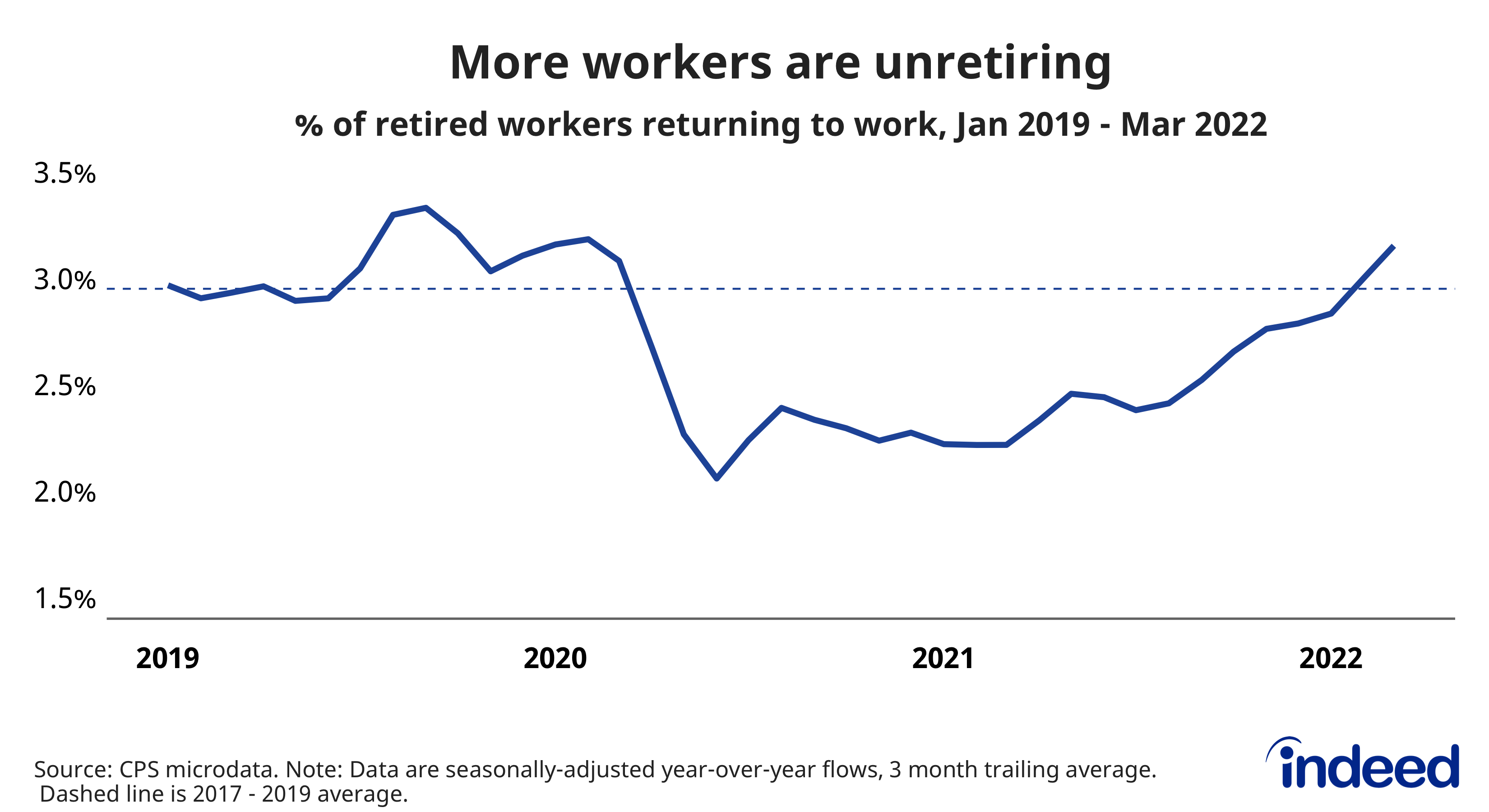
Labor supply has not grown as swiftly as demand, but, overall, people are returning to work. Some labor supply measures have been sluggish, including the labor force participation rate and the percentage of the working age population that’s employed. In fact, if you take into account the aging of the population, which means a larger share of the public is no longer of prime working age, the rebound in labor supply has been solid. When we focus on people from 25 to 54, which economists consider the prime working years, we see much stronger growth in employment and labor force participation. Meanwhile, a continued pickup in so-called ‘unretirements’, or retirees returning to work, would strengthen employment recovery among older workers.
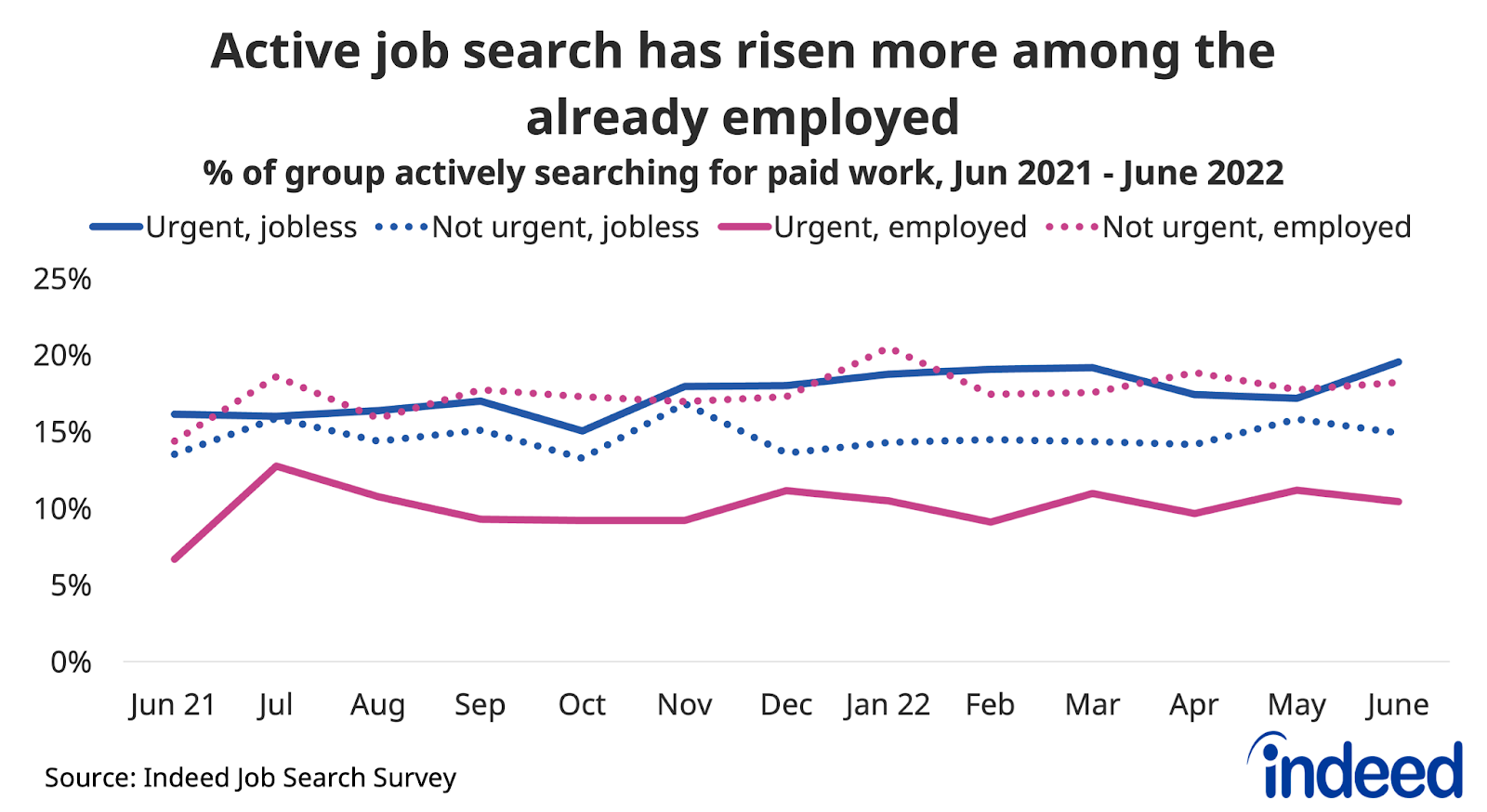
Active job search is up more among the employed
Many people are taking new jobs as more people are actively searching for work. But the increase in active job search has been largest for workers who already have jobs. The latest Indeed Hiring Lab Job Search Survey shows that the share of jobless respondents who say they are actively searching for paid work in June 2022 was 4.8 percentage points higher than a year prior. That’s a noticeable increase, but smaller than the 7.6 point increase for employed people. The smaller rise in active search among the jobless may be part of the reason why quitting has risen so much faster than the job finding rate of the jobless.
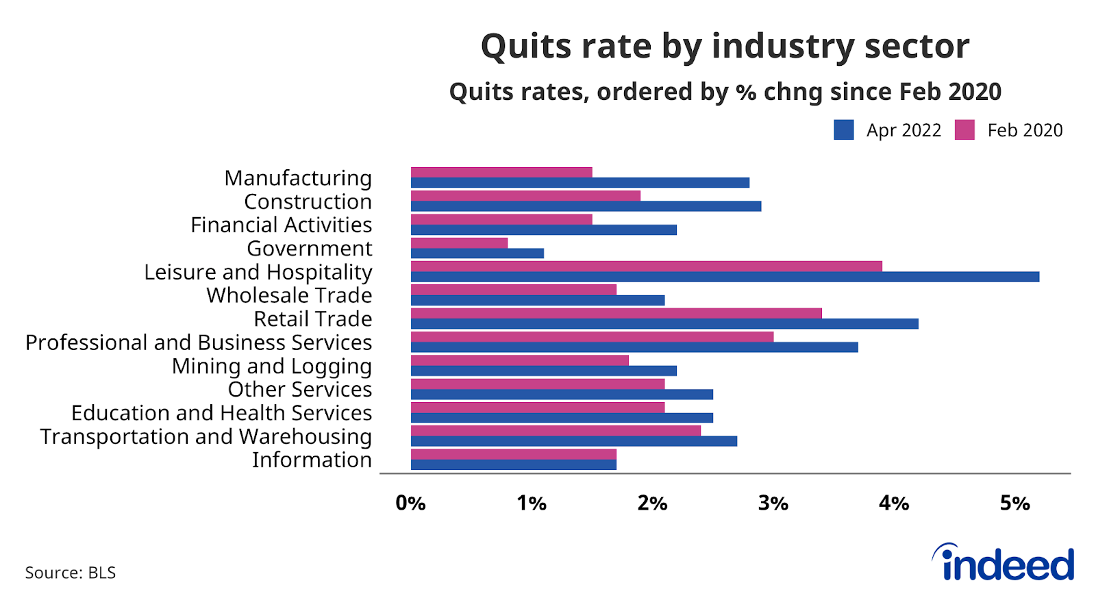
Workers are quitting jobs at a high rate
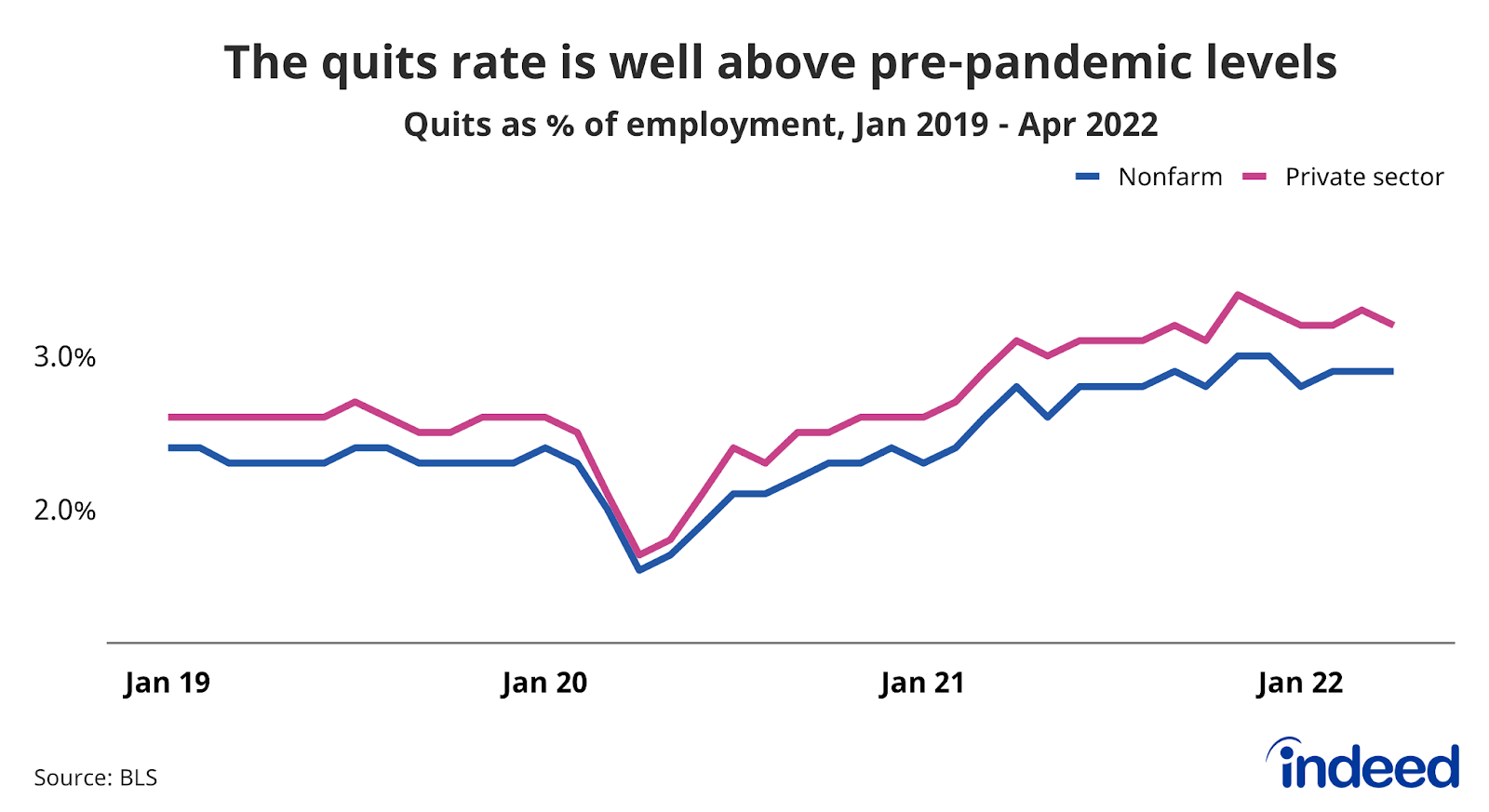
Employed workers are also finding new work, pushing the rate of job quitting to levels not seen in the 21st century. A remarkable 3.2% of private sector workers voluntarily left their jobs in April 2022. This high volume of quitting reflects strong demand for workers and has been concentrated in lower average-wage industry sectors such as manufacturing and leisure and hospitality. Some sectors have seen a pick up in quitting as of late, namely construction and financial activities.
The US labor market has been offering plenty of opportunities for workers while presenting some challenges to employers. However, the present situation undoubtedly will change. We will continue to monitor these trends and track others as the labor market evolves.
Methodology
Data on seasonally adjusted Indeed job postings are the percentage change in seasonally adjusted job postings since February 1, 2020, using a seven-day trailing average. February 1, 2020, is our pre-pandemic baseline. We seasonally adjust each series based on historical patterns in 2017, 2018, and 2019. We adopted this methodology in January 2021. Data for several dates in 2021 and 2022 are missing and were interpolated. Non-seasonally adjusted data are calculated in a similar manner except that the data are not adjusted to historical patterns.
The number of job postings on Indeed.com, whether related to paid or unpaid job solicitations, is not indicative of potential revenue or earnings of Indeed, which comprises a significant percentage of the HR Technology segment of its parent company, Recruit Holdings Co., Ltd. Job posting numbers are provided for information purposes only and should not be viewed as an indicator of performance of Indeed or Recruit. Please refer to the Recruit Holdings investor relations website and regulatory filings in Japan for more detailed information on revenue generation by Recruit’s HR Technology segment.
The data from the Job Search Survey is based on 11 online surveys of 5,000 US adults ages 18-64 starting in late May 2021 and continuing through June 2022 and continuing through March 2022. The first survey was conducted May 26-June 3, the second July 12-20, the third August 10-18, the fourth September 13-29, the fifth October 11-20, the sixth November 8-18, the seventh December 6-22, the eighth January 10-24, the ninth February 7-21, the tenth March 7-21, and the eleventh April 11-23 and the twelfth May 9 – 23 and the most recent from June 12 – 27. Weights were applied to each survey to match respondent distributions across age, educational attainment, race/ethnicity, and sex with the 2020 Current Population Survey’s Annual Social and Economic Supplement.